The perfect programming font?
22 April ’17
Ok I’ll share a secret here: I have a tendency to obsess over little details. A poet once said “it’s the little things that make the world”, and this is one of the greatest truths to me.
So let’s talk about one of these little things I can obsess about: fonts.
After having spent way more time than I probably should searching for the perfect programming font, I have come up with some candidates. My criteria includes first and foremost readability, but also character proportions, slashed/dotted zeros, l (L) vs I, and yes, even beauty.
One of the first fonts I remember using other than the Windows’ default Consolas was Inconsolata-dz (a variant of Inconsolata). It is a readable and beautiful font, but one of the little things that annoy me is the width and character spacing, which tends to spread stuff horizontally more than I’d like.
Then I tried Monaco, a font that ships with macOS (except I put it on Windows). It’s a very stylish one, for sure. I used it for quite a while, until I got annoyed by it’s, how should I put it, “opinionated” style. I don’t know, it’s as if it’s simply too stylish for a programming font. By the way, check out monofur if you DO like your stylish programming fonts.
Then I did try Source Code Pro for a while, but felt it suffered from the same problem as the Inconsolata family.
I stumbled upon mononoki, an awesome font. I ended up not using it after having some problems with JetBrains software, but I still think it’s a great font. Readable, good spacing, pleasant to look at.
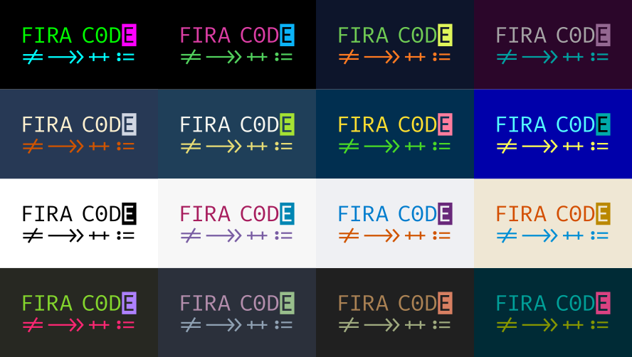
I believe that’s around the time when I found about font ligatures. What it does is merge multiple characters into one, useful to turn stuff like ==, >= and =< that we use all the time into more pleasant-looking glyphs. So, the first ones I tried were Fira Code and Monoid. The problem is that, while the ligatures are pretty cool, for some reason I couldn’t get myself into liking these fonts’ styles.
At this moment I felt like I’ve seen it all. As if I had mastered the Tao of Backup, but for fonts. That’s when I stumbled upon Input. It’s a non-monospace programming font. The blasphemy, right?! What about our carefully aligned ASCII art? Well, turns out you don’t really NEED a monospace font to program. It’s not like Sublime Text will yell at you or something. No, really, I promise. While I didn’t particularly enjoy Input’s look and eventually dropped it, I felt it’s a very important turning point for programming font development. You can design a font for programming and have it not be monospaced. I hope we get to see more of these with time…
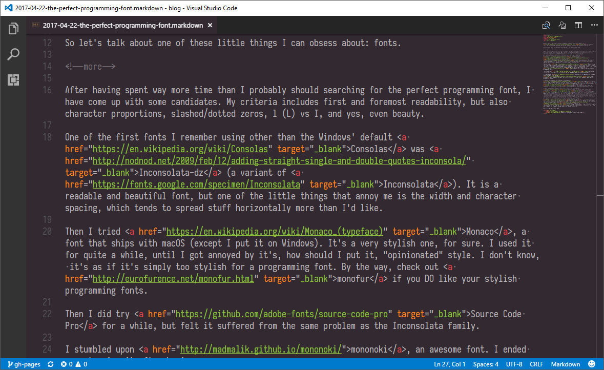
So, what am I using right now? I’m currently testing this font called Iosevka. It’s a beautiful and readable font, and a pretty narrow one. Maybe a little bit TOO narrow, but I like it. Oh yes, it has ligatures too. Currently pairing it with the Hopscotch theme for Visual Studio Code (Yes, I think it’s better than Sublime Text, Atom and Brackets. No, it’s not a bloated mess like Visual Studio). I think it’s one of the most readable and pleasant-looking combos I’ve come up with so far.
My conclusion to this topic is that there’s no conclusion. Fonts are a very personal thing, people have different priorities and different aesthetics standards. So I encourage you to try out all these fonts and more to find the one that suits you the best. If you do, please report back in the comments!

